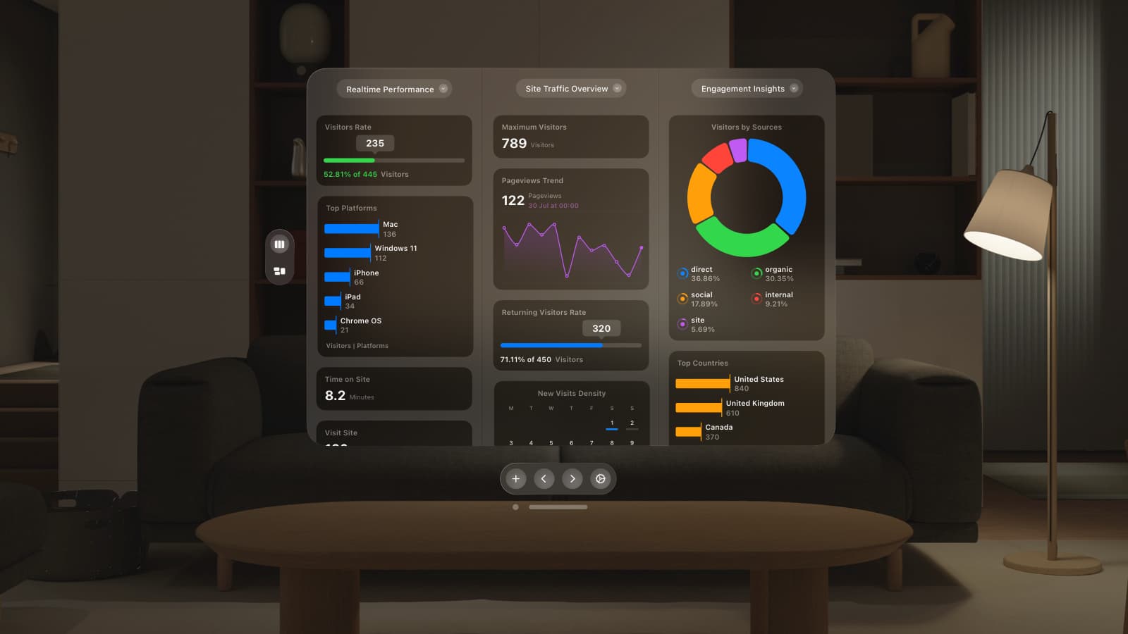
Today we’re pleased to introduce Timeline – a dramatically improved way to see how the number of people on your site has varied over the past 48 hours.
We felt Timeline, along with the Traffic widget and Notifications contained 3 of the most important pieces of information you need in real-time, so they’re now the most prominent areas in the GoSquared Dashboard interface.
Prioritisation
Glance to the top left of Dashboard and you’ll always have “Traffic” showing the total visitors online number and dial – so you can immediately see how many people are online, and compare this to your 7 day max.
Top centre we have the new “Timeline“, showing you your traffic for the past 24 hours, overlaid on the previous 24 hours before that.
In the top right corner “Notifications” shows you a list of all recent traffic spikes and dips, giving you quick and easy access to in depth snapshot reports about the state of your site at that time.
Works everywhere
As with everything in GoSquared, the latest improvement to Dashboard work on all devices, so even if you’re out in the field on your iPhone you can still see everything you need about your site in real-time.
Let us know your thoughts
We hope you’ll love the latest improvements to Dashboard, and we have a lot more in the labs that we just can’t wait to start rolling out to you.
Let us know your thoughts on the new Timeline via Twitter – we’re @GoSquared, or via email.

