With the latest update to GoSquared we set ourselves the target of achieving a smooth 60 frames per second for all the core UI and animation, across all devices.
There is no silver bullet in the matter of making web pages and web apps render efficiently — instead the best approach is to understand the different things that can cause a page to render slowly, and optimise them in turn, following some basic rules and best practices.
What actually happens in the browser?
Before understanding how to optimise web sites and applications for efficient rendering, it’s important to understand what is actually going on in the browser between the code you write and the pixels being drawn to screen. There are six different tasks a browser performs to accomplish all this:
- downloading and parsing HTML, CSS and JavaScript
- evaluating JavaScript
- calculating styles for elements
- laying out elements on the page
- painting the actual pixels of elements
- compositing layers to the screen
This post is only really focussing on the aspects related to achieving smooth animations without visual delay. I won’t focus on the parts about downloading and parsing assets.
Only 16ms per frame
In the typical flow of drawing to the screen, for each frame the browser will evaluate some JavaScript, if necessary, recalculating style for elements and recalculating layout if styles are modified by JavaScript. It will then draw a subset of the page to various “layers”. Then it will use the GPU to composite these layers to the screen. Each of these stages has its own cost, varying on what type of thing your web page or application does. If you’re aiming to achieve a smooth 60fps then the browser only has roughly 16 milliseconds to accomplish all these.
Re-layouts
“Layout” is a term used to describe the geometry of a page. That is, where every element is and how big it is. When you modify the geometry of an element using JavaScript (say, by changing margin, padding, width, height etc.) the browser does not immediately recalculate the geometry for every part of the page that’s affected.
Instead it keeps track of which parts of the page are “dirty” (i.e. in need of recalculating) and defers the calculation until the geometry next needs to be read, either by JavaScript if you’re accessing a property like offsetWidth, or by the renderer once it’s time to draw the page to the screen. As a result, it’s generally best to allow changes to queue up as much as possible and avoid forcing the browser to re-calculate layout several times per frame.
Take this example:
// els is an array of elements
for(var i = 0; i < els.length; i += 1){
  var w = someOtherElement.offsetWidth / 3;
  els[i].style.width = w + 'px';
}
What is happening here is that for every iteration of the loop, the browser has to make sure that all queued changes are applied in order to calculate the value of someOtherElement.offsetWidth, and then apply the updated width style to the next element in the array. This updated width attribute will then invalidate the offsetWidth property on someOtherElement, meaning that for the next iteration the browser will have to perform more expensive operations in order to calculate this value.
Now, assuming that changing the width of the elements in the array does not affect someOtherElement‘s size, take this example:
var x = someOtherElement.offsetWidth / 3;
for(var i = 0; i < els.length; i += 1){
  els[i].style.width = x + 'px';
}
This time, we’re doing all of the reading of properties first, then writing all the updated styles subsequently. This way, the browser only has to perform one reflow, in order to read someOtherElement.offsetWidth, and then all the updates to the elements in els can be queued up and applied all at once, when they next need to be read – either by subsequent javascript, or when the elements need to be repainted.
As a rule, reflows and relayouts should be kept to a minimum – wherever possible all properties should be read first, and then all updates written at once.
Re-paints
Painting is the process by which the browser takes its abstract collection of elements with all their properties, and actually calculates the pixels to draw. This includes calculating styles such as box shadows and gradients, as well as resizing images.
As a rule, a re-paint will occur once per frame, and will involve the browser re-drawing any pixels it has calculated as “dirty”, i.e. those affected by elements that have been added or removed or have had styles changed.
For smooth animation, it’s important to ensure that any re-paints are as efficient as possible. This means avoiding animating any properties that are expensive for the browser to draw, such as box shadows or gradients. It’s also important to avoid animating elements which have these properties, or any that will cause a re-paint of regions heavy with these effects.
It’s also worth noting that the browser will usually attempt to consolidate different regions into a single repaint for efficiency by simply drawing the smallest possible rectangle that encompasses all “dirty” pixels. This can be particularly bad, however, if you’re changing elements in different areas of the page (for example, if your webapp modifies elements at opposite corners of the screen, that’ll cause the whole page to be included in the bounding rectangle). There’s a good example of this in this blog post detailing improvements made to the Atom code editor. The best solution in these cases is usually to make sure the elements are rendered on different layers.
Layers, compositing, CPU and GPU
Back in the old days, browsers would keep one “frame” in memory which was drawn to the screen, and all paints would involve the CPU drawing pixels directly into this frame.
Nowadays, browsers take advantage of the GPU and instead draw some elements to separate “layers” using the CPU, and use the GPU to composite these layers together to give the final pixels drawn to the screen.
The GPU is very efficient at performing basic drawing operations like moving layers around relative to each other, in 2d and 3d space, rotating and scaling layers, and drawing them with varying opacities. To that end, it’s possible to take advantage of these efficiencies if you’re animating elements with these kind of properties.
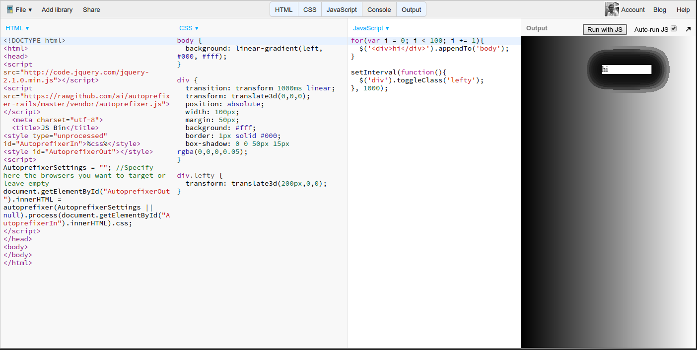
Take these two examples. Admittedly they’re somewhat contrived but they’re deliberately extreme to make the effect obvious. Both the examples take 100 <divs> with some heavy box shadows, and animate them horizontally using CSS transitions.
Firstly, using the left property:

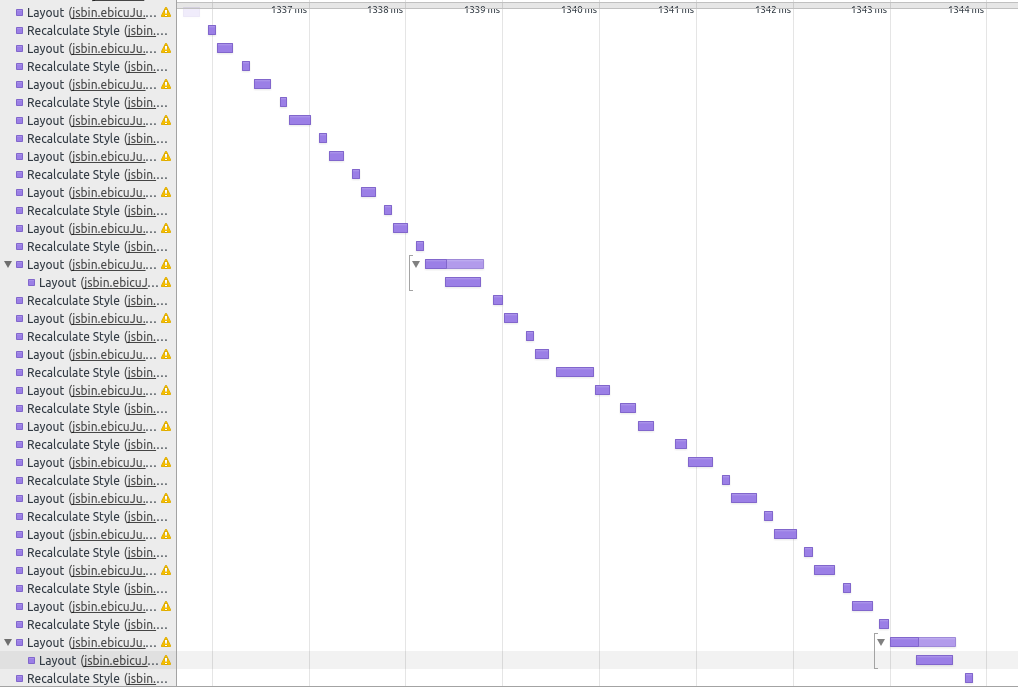
In this example, the browser is having to completely recalculate the pixels around these elements for every frame, which takes a large amount of computing power.
Here is what it looks like in Chrome’s DevTools timeline:
Now, let’s instead use a transform to animate the same elements

And here’s what that one looks like in DevTools
In this example, the transform forces the browser to place each of the <div> elements into its own layer on the GPU before compisiting them together for displaying on the screen. Now for each frame, the only work is in calculating the new position for each layer, which takes barely any computation power at all. There is no work done in recalculating the box shadows or background gradients – the pixels do not change within their layers, so there are no “Paint” events in the timeline, only “Composite Layers”.
There are a number of ways you can force the browser to place an element in its own layers. Usually applying a CSS transition on transform or opacity is enough. A common hack is to use transform: translateZ(0) – this has no visual effect (it moves the element 0 pixels in the Z direction), but the browser sees a 3d transform so it promotes the element to a new layer.
It is possible to overdo it, however. Don’t go creating new layers willy-nilly. Here’s an example of Apple overdoing it on their homepage and actually slowing it down by having too many composited layers.
It’s also important to bear in mind that with GPU-composited layers, there’s an inherent cost incurred when pushing the actual rendered pixels onto the GPU. If you have lots of composited layers and are animating properties that can’t be animated purely on the GPU, then the browser has to re-paint the pixels on the CPU and upload them to the GPU each time, which may actually be less efficient than keeping the layers non-composited and drawn entirely on the CPU. Here’s a great post by Ariya Hidayat explaining this in more detail.
A good way to see what’s going on here is to use Chrome’s DevTools and enable “show paint rectangles” and “show composited layer borders”. Show paint rectangles will show you exactly which areas are being re-painted for each frame.
If you’re seeing lots of them, especially in regions that contain a lot of elements or fancy css effects, you’re probably at risk of inefficient repainting. Show composited layer borders will show you exactly which elements have their own layers. It’s especially useful if you want to make sure that an element is properly on a separate layer.
It’s worth noting also that if you’re aiming for smooth animations on mobile devices, you should aim wherever possible to only animate properties like transform and opacity that can be animated entirely using GPU acceleration. Mobile devices’ processors are, as a rule, pretty terrible in comparison to their GPUs. As a result it’s best to avoid animating width or height or other such properties. With a little extra effort it’s usually possible to (for example) animate an element’s transform inside another element with overflow: hidden to achieve the same effect as changing its dimensions.
A more concrete example
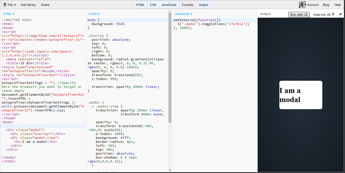
Here’s an example taken straight from our recent update to the GoSquared UI: showing a modal view.

Notice the techniques we’re using here:
- The overlay, which has a large radial gradient, uses the
transform: translateZ(0)hack to promote it to its own GPU layer. As it’s a full-screen overlay, rendering it in the same layer as the rest of the user interface would cause a re-paint of the entire interface, which would be extremely inefficient. By promoting it to its own layer and only animating theopacityproperty, the entire animation take place on the GPU which is really efficient. - The modal view itself is animated using the
transformproperty using atranslate3d, which again forces it to be rendered on its own layer. This means we can apply box shadows to the modal, and also not worry so much about whatever we choose to put inside it, because the entry animation again takes place entirely on the GPU without any re-painting.
In Summary
As I said at the beginning of this post, there’s no silver bullet for render performance. Depending on your exact use-case, it may be a matter of optimising any of a number of different parts of the render pipeline. Once you understand the various hoops through which the browser has to jump in order to get pixels onto the screen, it’s more a matter of maintaining a set of tools and techniques to apply to different scenarios.
This was just a brief run-down of the major potential bottlenecks one can encounter with rendering performance. The links below all expand on the matter in further detail if you’re interested, and if you have any other examples or suggestions of your own to add then please leave them in the comments!
Further Reading
If you’re interested in rendering performance and everything like this, there are some excellent resources online:
- “Pixels are Expensive” by Paul Lewis
- Runtime Performance Checklist by Paul Lewis
- Jank Free – a brilliant collection of resources
- Speed, Performance and Human Perception – presentation by Ilya Grigorik at Fluent 2014.


