We hear a lot about increasing engagement on social media, but it’s rarer to hear about increasing engagement on your site. Yet, the engagement of your website visitors is incredibly important to the success of your company.
Engaged visitors are more likely to buy your product, recommend you to a friend, and stick around longer.
Let’s take a look at 7 ways to increase engagement on your site, and then we will show you how to measure all the progress you’re about to make.
How to increase engagement on your site

Let’s start by looking at some great ways to increase engagement on any website and then we’ll look at the tools GoSquared offers to measure engagement in real-time.
1. Make the content flow

Starting with something that sounds simple but in reality is difficult to get right.
Your website needs to flow. This is about your content and your navigation. Making it easy for visitors to your site to find what they’re looking for is the easiest way to keep them engaged.
Here are some things to think about:
- Navigation should be, well, easy to navigate and offer a continuous flow that aids the visitor in getting from one place to the next.
- Use tagging and smart recommendations to help a visitor get the most out of their own visit based on their own interests. This kind of data-backed tailored marketing is much more effective than a mass approach.
- Break up long pages of texts with images, pull out quotes and other design elements.
- Avoid splitting articles up onto multiple pages. For a while people thought that this would help the powers-that-be-at-Google up you search rankings but it’s just irritating for visitors and is the perfect way to encourage them to leave your site.
2. Use automated email to encourage people back

Website engagement is not a one-time-only thing. We want visitors to return to our websites again and again. When only 2% of visitors become a customer on their first visit this is something you can’t afford to overlook.
Once you have engaged with a customer and have their email address on file it’s important to keep interacting with this person when they display interest. For example, by setting up an automated email that sends out after a known visitor comes to the website but does not complete an action such as buying or downloading an e-book.
3. Use chat prompts when visitors show exit intent

Some live chat tools offer the option to place chat prompts across your site. You’ll see one in the bottom right-hand corner now.
You can edit these prompts to say absolutely anything you like and they are a great way to grab your visitor’s attention or start a conversation. One of the options we have with the GoSquared Live Chat – which you can use for free to try this out – is to set a chat prompt to appear when the visitor shows what we call ‘exit intent’.
This is pretty much what it says on the tin – the visitor is displaying signs that they are about to leave your website.
By interrupting them with a chat prompt you avoid the forcefulness annoyingness of a mid-screen pop-up whilst still reminding them there’s more to explore.
4. Reduce page load times

A really easy way to stop a visitor giving up before they’ve even reached your site is to have it load quickly.
A site like Pingdom has an excellent suite of tools to measure how quickly a site loads and importantly they measure this data constantly and from across many locations around the world. It’s important to remember that just because a site loads quickly in your home or office it doesn’t mean it does in Europe, China or Australia.
Trim down your web site by removing unnecessary scripts. Remember that a lot of your visitors will be using a mobile device so it’s important – actually, it’s crucial – that any website you run is optimised for different devices.
If you want to get technical we’ve written a post over on our Engineering Blog which will show you exactly how we keep our own JavaScript light and fast.
5. Make it accessible with design and function

Much the same as making the content easy to get to and easy to follow, the content should be accessible and legible.
Your website should be tested for basic functionality in as many browsers as possible and that includes mobile browsers. We are all used to a very high standard of web design and functionality these days. We expect sites to load in fractions of a second and for design to be beautiful and easy to use.

Good, accessible design rarely means complicated design.
The content on your site should be designed to be read. Think about these things:
- Use large and spacious fonts that render well on displays both big and small.
- Help the text readability with neutral background colours that don’t overwhelm the text or the visitor’s eyes.
- Make headings clear and bold to break up the sections of text and space things out with clear and relevant images.
- Get the point across. Use images, use diagrams and use uncomplicated language. Your topics might be complex, but your words should be easy to understand.
6. A/B Test

The best solution to understanding how different designs work is to A/B test them.
This simple method shows a different layout to different visitors (usually just two are tested at the same time).
So, let’s say you wanted to increase the number of users commenting on your site, you could create a design that has a stronger emphasis on commenting and deploy it alongside your existing design.
Tools like Google Optimize, VWO, and Optimizely can test variations of a page against live traffic and return measurements on how each design performs. You can then use this information to choose which version of your site to roll-out for all visitors.
7. Be social

Making it easy for readers to share pages from your site on Twitter, Facebook, LinkedIn and all the rest is a great way to ensure higher engagement.
A tweet from an industry big-wig recommending a product, or a post from a friend enthusiastic about an article are great forms of social marketing.
Social media not only encourages further sharing with a level of peer-to-peer trust involved but it also helps build an audience of long term readers and loyal users.
How can you measure engagement?

So, you’re ready to try out some new things on your site to increase engagement time, but you’re also going to need a way to measure if your work is having any effect.
If you’ve not already got an analytics tool set up on your site then you can give ours a go for free. It’s really simple to use and quick to get started. What are you waiting for?
Got it? Ok, let’s look at how we can measure all this new engagement you’re about to get.
We’re going to use our own dashboard in these example as it’s what we know best, but you should be able to find similar features in other tools you might be using.
Time on Site

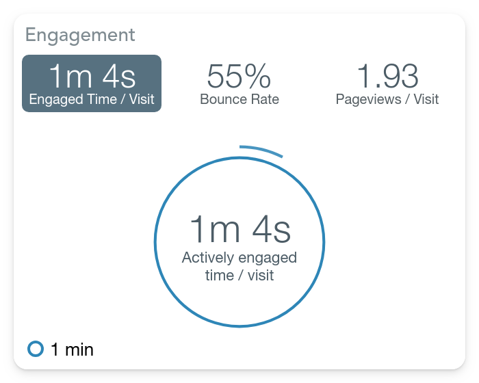
It’s impossible to use traditional ideas of bounce rate to define the engagement on a page.
What’s really important to know here is that the majority of tools register a bounce when the user only visits a single page before leaving your site. This isn’t necessarily a negative action, especially if you have a one-page website, or if your landing page gives a comprehensive overview of your offering.
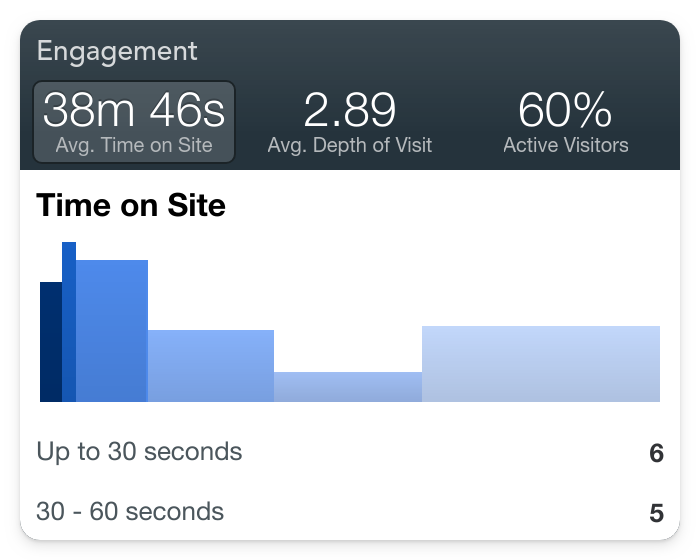
Instead at GoSquared we use time as a measure of bounce, so a legitimate visit will be registered if your visitors look engaged, even if that’s only with one page of your site.
You’ll often see this referred to as “stickiness” – simply, how long does your visitor stick around for. If it’s not clear – you want a sticky site. The stickier the better in this case.
Using time on site as a core engagement metric is a great indication of whether the changes you are making are helping to keep people online longer.
If you’ve got to this point and are thinking “What on earth is a bounce?” you might find our analytics guide useful. You can download The Fundamentals of Analytics for free and get to grips with all the basics of measuring your site’s success
Depth of Visit

Depth of visit is a way to see how many pages of your website the average visitor looks at. Whether this metric is important to you will really depend on the type of website you have. Our post on the metrics that matter to your site will be helpful in figuring this out.
Active vs. Idle

Our visitor activity detection is incredibly accurate and powerful – we think it’s some of the best analytics software available today.
An “active” visitor is someone who has your website open on their current tab or window. AKA they are looking directly at your website.
An “idle” visitor might have your tab open in the background whilst they are looking at something else or comparing your product to someone else’s, or have gone off to make a cup of tea.
This is an important engagement metric for a lot of businesses because the higher percentage of active visitors you have it’s safe to assume your website content is more engaging and more effective than if you had a large percentage of idle visitors.
Remember that idle visitors doesn’t mean uninterested or failed visits – your website is just not grabbing and keeping your visitors in the way you might like it to.
At the core of it “Active vs. Idle” helps you understand more than just how many people are online, but how many people are actively engaged by your content right now.
Start using GoSquared to measure engagement today

We love hearing from businesses who have tried out the tips we share so please do get in touch on twitter or via live chat.
If you want to try out any of the tips in this post you can get our free Analytics tool, our free Live Chat tool, or sign up for the beta version of our Marketing Automation tool.

