We’ve shown you how to make pie with Adobe’s vector drawing application, but how about those times when you need to give someone a cake?
Let’s start with a new document (obviously) – choose web if that’s what you’re planning to use the final image to your site as this will ensure all measurements are in pixels and colours are set in RGB. The canvas size doesn’t matter too much either, but 800×600 makes sense in this scenario.
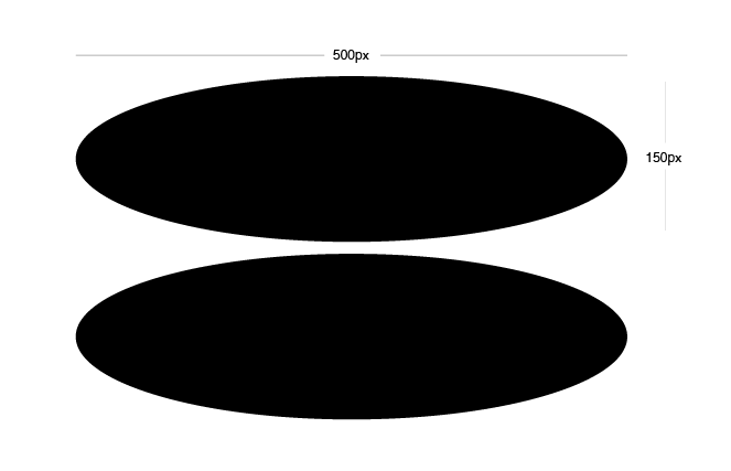
To start the basic shape, use the Ellipse Tool (L) to draw a stretched circle with vaguely the same dimensions as those in the image. Make a couple of copies of this, and drag them off the canvas for now. Make another copy by Alt dragging the circle directly below by about 150 pixels. Also hold down Shift while dragging to keep the duplicate copy of the shape aligned to the original.
Using the Direct Selection Tool (A) select the top point of each ellipse and delete it by hitting backspace.
Using the Direct Selection Tool (A) again, select the point on the right of the top ellipse, and holding down Shift also select the same point on the lower ellipse. Now join these two points by going to Object > Path > Join (Command J). Now do the same for the points on the left of each ellipse. This will create a single shape from our two deformed ellipses.
To get this fairly random looking shape looking vaguely cylindrical we need to fill it with a gradient. Go the Gradient Palette (Command F9) and make 3 colour points. Make the points at the two ends of the gradient spectrum the same light brown colour. Make the third point slightly darker brown positioned at about 85%.

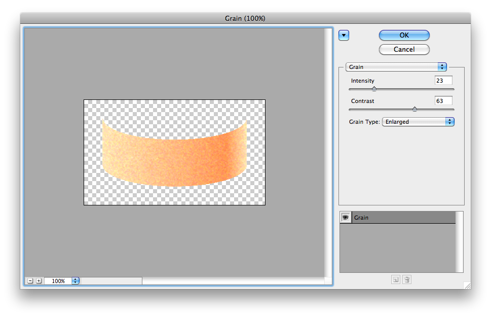
Now for something that many people don’t use enough in Illustrator – Photoshop Effects. Make a duplicate of the main cylindrical shape we just made and go to Effect > Texture > Grain… This will bring up the Photoshop Effect Palette that will be pretty familiar to anyone who’s ever dabbled in Photoshop. These textures aren’t vectorised, though, so use them with wisely otherwise you could quickly defeat the whole point of using Illustrator in the first place.
Once you’ve clicked OK on the Photoshop Effects Palette, you’ll see your new textured cake shape. Change its Opacity to about 65% by going to the Transparency Palette (Shift + Command + F10). Now just align the textured shape over the previous non textured shape of the same size.
So we’ve created the main part of the cake, and I guess you can take that out the oven for now and leave it to cool. Now for the icing. This part is pretty similar to before where we had the the 2 ellipses. Create another 2 ellipses of the same size as before (this is where making a few copies comes in handy) and keep them aligned, but ensure they’re closer together than the ellipses we used for the main part of the cake. This time, delete the bottom point on the top ellipse, and delete the top point on the lower ellipse using the Direct Selection Tool (A). Now Join (Command J) the points and make it into a shape like below.
Fill the shape we just created with a 3 colour linear gradient. Place each colour in the same positions as before – 2 of the same colour points (I’ve used just white here) at each end, and then a very slightly darker colour at 85%. I used a slight purple just to spice things up a bit. Make your icing any colour you like.

Position the layer of icing on top of the main cake base by ensuring it’s above everything else. Send the icing to the front by pressing Command + Shift + ].
Now take another one of those ellipses that you dragged off the canvas earlier. Fill this ellipse with white and Feather (Effect > Stylise > Feather) it with a Feather Radius of 15px. Ensure this circle is above everything (including the icing layer we just brought to the front) and align it to the horizontal centre, and vertical top of the main icing layer. The Alignment Palette can be accessed by hitting Shift F7.
Now select the icing layer that we formed with our two ellipses earlier. Use the Add Another Anchor Point Tool (+) to add a bunch of new points on the bottom edge of the icing shape. These don’t have to be accurately spaced out or anything – they’re supposed to give the effect of dripping icing once we’ve moved them about in the next step.
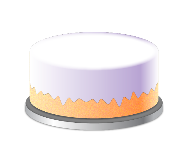
Using the Direct Solution Tool (A), select each of the points you just created, one at a time. Move every other point down a few pixels, and move a few random points up a few pixels. With a little experimentation, you should get a fairly natural effect similar to that in the image below.
To make the icing look like it’s slightly raised above the cake it’s dripping from, add a subtle drop shadow to the icing shape. Select the icing shape and go to Effects > Stylise > Drop Shadow. On the Drop Shadow Pane, set the Mode to Normal, Opacity to 45%, X-Offset to 0, Y-Offset to 1px, and Blur to 0px. Ensure the colour is black or very dark brown.
We’ve got a fairly tasty looking cake, baked and iced, now for a shiny silver base to sit it on. Using the same method as earlier, create two larger ellipses and delete their top points. Join (Command + J) the two ellipses to make one very short cylindrical shape just like a wider, shorter version of the cake base shape. Fill this shape with a linear gradient of 4 colours to give a chrome like appearance keeping these colours in greyscale. Give this cylindrical shape a drop shadow (Effect > Stylise > Drop Shadow…) Set the drop shadow Mode to Normal, Opacity to 65%, X-Offset to 0px, Y-Offset to 1px, Blur to 3px, and ensure the colour is black.
Create another ellipse of the same size as the ones used to create the shape we just made, and fill it with a dark grey. I used a colour of 50% black.
Drag another one of the ellipses onto the canvas that you dragged off earlier – keeping it the same size as the main cake shape. Fill this circle with a very dark grey (darker than the last one we created) – I used 80% black. Feather this ellipse with a Feather Radius of 15px.
Align each of these 3 shapes to the horizontal centre and Group (Command + G) them. Send them to the back with Command + Shift + [ and ensure they are horizontally centred with the main cake shape too. Now you have a cake, baked, iced, and on a shiny plate!
Now for the candles. It’s time to draw a few more ellipses – this time we need to make a really tall, thin version of the basic cake shape that we made before. Use the same method – draw two small ellipses directly above one another and then delete the top points and Join (Command + J) the two shapes. Fill this shape with a 3 colour linear gradient with the 2 end point colours the same, and a darker shade of the same colour at around 85% along. Your candles can be any colour, but I decided to go for a bright pinky red.
Make a copy of an ellipse of the same size as the ones you just used to create the basic candle shape. Fill it with a similar, preferably slightly darker colour as that of the main candle shape. Align this to the top of the candle shape so it forms the top of the candle.
Make another copy of that same ellipse, but scale it down to about a third of the original size. Fill this ellipse with a dark colour, I just used black. Feather this ellipse with a Feather Radius of 2px. Align this to the centre of the ellipse sitting on top of the candle.
Make yet another copy of the ellipse and proportionally stretch it so that it’s slightly larger than the candle width. My ellipse was around 50px wide and 14px high. Fill this ellipse with black and Feather it with a Feather Radius of 12px.
That’s the main candle made, now to light it. To make the flame, draw another ellipse, but this time stretch it vertically so it’s taller than it is wide. Using the Convert Anchor Point Tool (Shift + C) click on the top point of the ellipse you just made. This will cause that point to become a vertex rather than a smooth curve. You should now have a nice flame shape. Fill it with bright yellow.
To make the flame more realistic, make a copy of the shape and proportionally scale it so that it’s slightly smaller. Align it to the bottom centre of the first flame shape. Fill this with a slightly darker shade of yellow. Repeat this same step a few times, making the shape smaller and filling it with a slightly darker colour. The centre of a flame, if you look closely, is actually made up of a spectrum of blue. Fill the smallest couple of flame shapes with blue. Ensure all of these shapes are horizontally aligned to the centre and vertically aligned to the bottom of one another. It would probably make life a little easier to Group (Command + G) the flame shapes together so that you can easily align them slightly above the centre of the candle shape.

Now make a few copies of the whole candle shape (again, easier if you Group all the candle elements together here) and position them on the top of your cake however you wish.
Now just dim the lights, and you’re ready to sing happy birthday. Here’s the outcome. Yum.
![]() Get the Adobe Illustrator CS2 File [705KB]
Get the Adobe Illustrator CS2 File [705KB]
Don’t have Adobe Illustrator? Download the SVG.
Don’t forget to save some cake for me when you’re done. Thanks for reading!

