Just like finding our way around a physical store or building, it’s also possible to direct users around a website. There are many UX elements that all serve to navigate users around your site and ultimately encourage certain behaviours. Call-to-action buttons are no exception, as they instantly direct users to the next logical follow up action, whether that’s to view your products or even get in touch with you. That is when everything runs smoothly!
In reality, as with every facet of your website, it’s possible to facilitate the intended actions of a CTA button through great placement and effective design, just as it is to confuse or even annoy users through poor tactics. When the latter happens, your website can actually miss out clicks, impressions and sales rather than gain them.
Want unmissable, not unclickable call-to-action buttons on your website? Here is our ultimate guide to call-to-action buttons featuring everything you need to know, including 60+ unmissable examples we’ve collected from across the web.
What is a Call-to-Action button?
Quite simply, a call-to-action button is a clickable element on your website that directs users to a complete particular action.
As you browse the web every day, you likely stumble across hundreds of buttons asking you to perform an action – whether it’s to subscribe for instant news alerts via email, to sign up for a gym membership TODAY, or to buy that new t-shirt you’ve been waiting for. In the world of online marketing, these buttons are often referred to as call-to-Action buttons.
Call-to-Action buttons (CTAs) are all around us. We see hundreds, but we rarely click a single one. So how can you improve the number clicks of your call-to-action buttons? Everything hinges on knowing the right tactics.
First, let’s take a look at the types of call-to-action buttons you could be using, depending on the actions you are wanting users to take on your website.
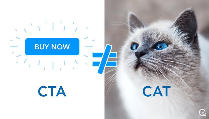
P.S. While autocorrect may automatically change “CTA” to “CAT”, the two are in fact totally unrelated.
Types of CTAs (call to action) web buttons
- Closing the sale
- Event promotion
- Form submission
- Lead generation
- Lead nurturing
- Product or service discovery
- Read more
- Social sharing
There is a lot to learn about call-to-action buttons, so we’ve broken it down into a few core sections you can jump straight to:
- What makes a good Call-to-Action button?
- How to write persuasive copy for your Call-to-Action buttons.
- How to optimise the colour and design of your Call-to-Action buttons.
- How to design buttons for mobile and desktop.
- 60+ examples of the best Call-to-Action buttons in the wild.
Good call-to-action buttons: How to create successful CTAs
Let’s go back to basics here. What is the purpose of a call-to-action, whether it’s in the form of a button on your website or any other marketing tool? The answer is that you want to encourage users to complete a specific action. As we’ve established, this could be to purchase a product, give you a call, or even sign up for your newsletter among many other examples.
So when it comes to creating successful CTAs, these objectives must be factored into the types of buttons you create along with how they are presented to your users. These are some of the top points that need to be considered to maximise those all-important conversions.
It’s worth remembering the easiest button for a visitor to click is always the “Back” button – so let’s ensure we keep users on your website for longer with effective CTAs!
Make your Call-to-Action buttons look like buttons
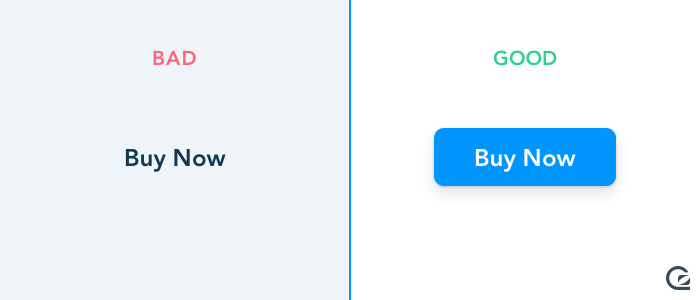
We’re looking at you, Apple. Since iOS changed its design a few years ago, there’s been a trend in web design to make buttons more and more minimal. Often you see buttons without borders or backgrounds, and it can often be hard to judge a button from just a short snippet of text.
In order to make sure your buttons are unmissable and are easy to click, ensure they look like buttons – use a bold font, a large font size, give a generous amount of space around the text, have a strong border around the text, and ideally have a bold background that contrasts with the text colour.
Ensure your CTA buttons stand out
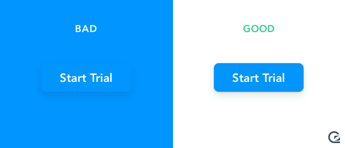
Even if you make your button look like a button, you still need to make sure it’s on a sensible background that doesn’t clash and has enough space around it to stand out.
It may sound obvious to ensure your buttons stand out from the backgrounds they’re on, but it’s common for websites to have a consistent button design that’s used across a variety of backgrounds – from block colours, to patterns, to vibrant photos.
Ensure your site is structured in such a way, that when content, intended for reading or clicking, is placed on top of a background, the background colours won’t clash with the text and buttons on top. A good practice is to ensure background photos have a semi-transparent layer of colour on top that contrasts with the text to ensure the content on top stands out. For example, if you have white text on top of a photo, ensure there’s semi transparent dark overlay on top of the image to avoid a clash.
You also want to ensure your buttons are given enough space, so they’re not crowded out by other components on your pages. Be generous with white-space so buttons can stand out from text and images.
Combine a header with your call-to-action buttons for better clarity
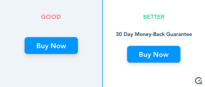
We all have short attention spans when we’re browsing around the web. Visitors rarely have time to read every word on the page or to fully appreciate the full story you’re trying to tell. Don’t fear repeating your key message throughout your page – advice that’s especially true for your call-to-action buttons.
Just above your call-to-action button is a perfect place to remind the reader what they’re on a page for, and to add some reassurance about what the button will do. For example, if you’re running an ecommerce store, your text above the “Buy now” CTA could be “Purchase today for free shipping”. For a SaaS product, you could say “Try it free for 14 days” just before the “Start trial” button.
Remind the visitor what they’re there for

The copy you choose for your button needs to be effective and concise. You have no room for a stray unnecessary words on your CTA buttons. Some of the best converting buttons use just one or two words. You ideally want your button to clearly convey an action of some sort such as “Start Trial” or “Buy Now”.
Buttons without a verb – for example just putting the price of an item in a button-like shape – can lead to doubt in the user’s mind. The user may second guess the action – here are a few things that might run through their mind for a split second:
- Is this button going to buy the item?
- Is the button going to show me pricing options?
- Is this just the price and where is the “Buy” button?
How to write persuasive copy for your Call-to-Action buttons
Strive for concise copy
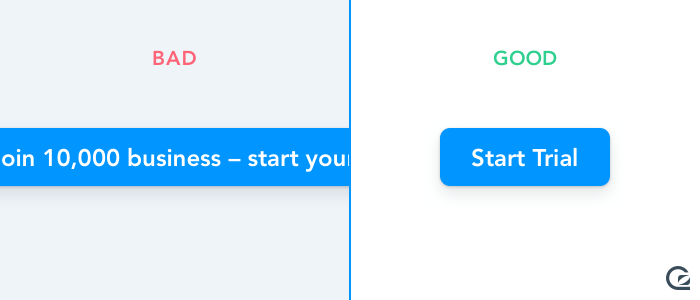
“Succinct doesn’t mean short. It means a high ratio of ideas to words.” – Paul Graham
The best Call-to-Action buttons tend to have very few words, but every word is essential to understanding what will happen when the button is clicked.
It can be tempting to explain in detail what your button will do, but when you add anything but the essential words, you’ll find your CTA will become so long it’ll run off the page and become too hard to read. Buttons that are unreadable also tend to be un-clickable.
Write copy that encourages action

A lack of clarity in what a button does can lead to poor conversion – if visitors don’t know what clicking a button will do, then it’s likely they’ll avoid it.
Good CTA buttons usually contain words that encourage action, such as “Download”, “Start”, or “Request”. A few examples you frequently see in the wild:
- “Start your trial”
- “Download for free”
- “Request a demo”
Emphasise a sense of urgency
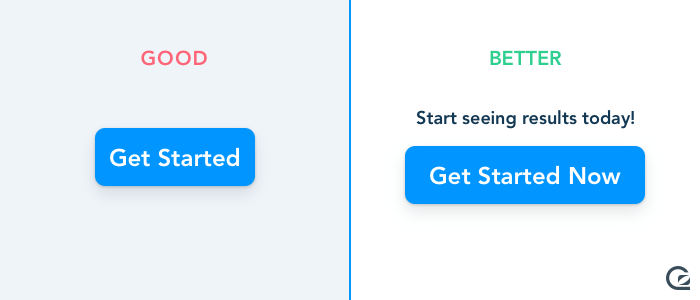
It’s very easy to be passive when browsing the web – scrolling and viewing, and never taking action. Good CTAs and their accompanying landing pages often harness a sense of urgency (some of the kids might call it “FOMO” these days) to encourage you to take action now, rather than later.
Landing pages set-up to drive webinar signups, for example, often utilise a countdown timer to show you have a time limit before the opportunity has passed.
Something that’s considerably less technical than implementing a countdown timer, though, is to add an urgency-inducing word to the button copy – for example adding the word “Now” can help drive action.
A few good examples of using urgency-inducing words to make your CTAs more clickable:
- “Increase your conversion today”
- “Get started now”
- “Watch demo now”
Use the first person
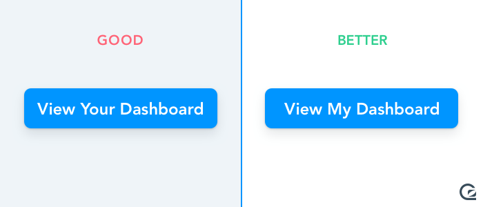
While not suitable for the tone of voice of all brands, some studies have shown that using first person (me) rather than second person (you) in your button copy can increase conversion considerably.
People tend to make purchasing decisions with emotion in addition to the facts they can gather, so it’s possible the use of first person helps users feel more personally connected and motivated to click and convert.
Tim Ash on the Clickz blog has a good short post on how different pronouns can impact your conversion rates.
Optimising the colour and design of your Call-to-Action buttons
Choose a bold colour for your buttons
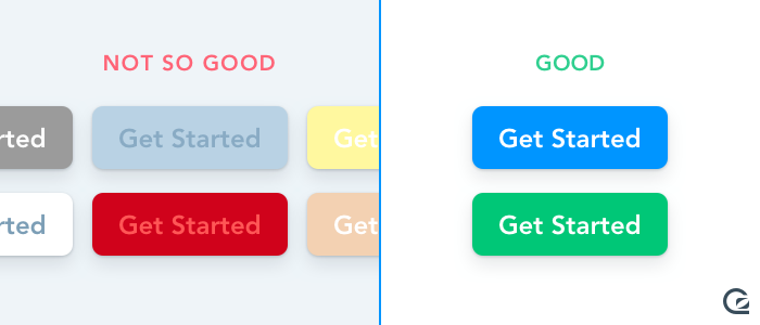
The colour of your Call-to-Action buttons obviously depends on the key colours you associate with your brand. But there are a few tips for ensuring you design effective, and good looking CTAs by using colour sensibly.
It’s widely reported that bold shades of green and blue make good colours for buttons; colours associated with negative actions tend to perform worse – red and black are generally reported to be less effective. The truth on colour though, is the right choice is totally dependent on your site, your brand, and everything that surrounds your button.
You can test your button colours to establish what works best for your specific situation, but it’s rarely a good use of your time to test as extensively as Google famously did several years ago with 41 different shades of blue.
Ensure you have good contrast between text and button colour
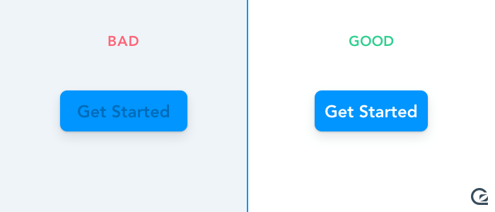
Whatever the colour of your buttons, and whatever the colour of the background behind your buttons, you also need to ensure the colour of your text has high contrast.
A popular technique is to simply use the same colour as the background behind the button, so the text on the button is almost like a cutout of the button itself, revealing the background behind.
Use a bigger font-size, and a legible font

No matter what your font-size is right now, make it bigger. When you’re heads-down working on a design, you can get caught up in the details of the page and often forget how little time you have to persuade a visitor to engage and convert.
Bigger isn’t always better, but when it comes to CTA buttons and their font-sizes, it’s almost always a good idea to ensure the font size is noticeably larger than the standard body font size of the page.
Choose a solid, attractive shape for your buttons
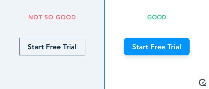
There’s no need to reinvent the wheel when it comes to button design. There’s always an aspect of “fashion” when it comes to designing buttons that convert well and look great, but here’s a few shortcuts to help you design a good button:
- Rectangles with generous padding around the button copy are a logical starting point.
- Rounding the corners of your buttons helps the user visualise the start and end of the button.
- Adding a shadow to buttons can help the shape “pop” off the page and float above the background clearly.
- A block background rather than just a border will help the button stand out.
Mobile and desktop optimised Call-to-Action buttons
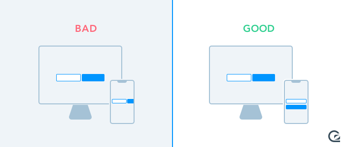
When focused on designing great buttons that are big and stand out from the page, it can be easy to forget the multitude of devices a user might be viewing your page on.
It’s all too common to design a great experience for desktop users, but totally forget about the mobile experience. A good habit is to try wherever possible to design for mobile first and scale from there, so the desktop experience is an enhancement to the mobile experience, rather than working down in size from desktop.
Modern desktop browsers have a “responsive design mode” to make it easy to see how your pages look on different devices such as mobile phones and tablets, so always try viewing your pages in a bunch of different sizes before going live to avoid any obvious glitches that could ruin your conversion on smaller screens.
Put your first Call-to-Action button above the fold
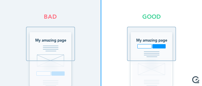
Does “the fold” still exist? People still scroll, and everyone’s devices are different, but ensuring your key CTA is as high up and as visible as possible on your landing page is essential.
Don’t be afraid of making your button too obvious – obvious is good in a world of short attention spans and impatient users. You can repeat your CTA further down the page too, but ensuring it’s easily visible when you first load the page will give users an instant understanding of what you’re ultimately asking them to do by consuming the content on your page.
Remove choices
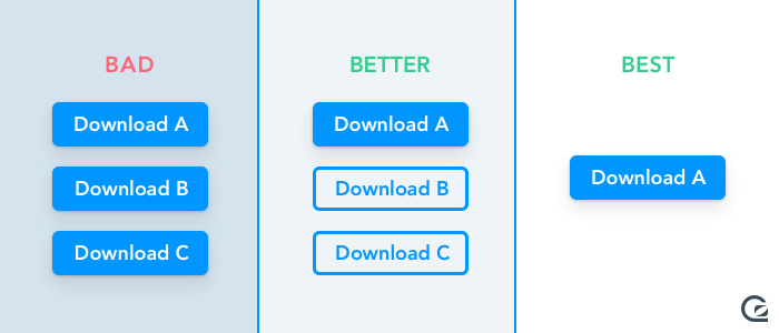
Crafting a good Call-to-Action button assumes you’ve already decided what you want the key action to be for visitors when they look at your page. If you haven’t nailed down the most important action for visitors to take, then it’ll make a lot of layout decisions hard.
In order for a CTA to be as effective as possible, it needs to stand out, and it needs to be the main focus on the page for the visitor to engage with. If you give visitors too many options, you risk confusing and overwhelming them.
If you need to offer more than one choice – for example, if you’re offering a download for a desktop application or mobile app – strive to prioritising one option over the others. This sometimes may require more work on technical implementation (for example, detecting the visitor’s operating system) but can be worth it in terms of increasing your conversion rate.
It’s worth remembering the easiest button for a visitor to click is always the “Back” button.
When to repeat your Call-to-Action button on a page

How often should you repeat a CTA throughout your landing page? It’s always a tricky balance – too frequently and you come across desperate, like a child nagging their parent for a toy. Too infrequently and you risk losing visitors who would otherwise happily sign up.
As with most topics relating to business, “it depends”, but the key factor here for deciding how often to repeat a Call-to-Action button is the length of your landing page.
A simple rule of thumb we use is if you’re scrolling the page on your laptop and you can see your same CTA repeated more than once on the screen at the same time as you’re scrolling then you’re probably overdoing it.
Always be testing
Call-to-Action buttons are one of the critical components of your pages that are worth A/B testing regularly.
Even small changes and tweaks can lead to big improvements in conversion rate – adding a word, removing a word, changing a colour, or increasing the font size can all lead to improvements. But you’ll never know unless you try out a few variations and see what works for your specific site and situation.
60+ CTA examples in SaaS
Software as a Service (SaaS) companies primarily use CTAs to drive people to sign up for a free trial of their product or to book a demo with a sales team. Here’s a selection of CTAs from the most prominent SaaS businesses right now.
Disclaimer: we obviously don’t know how well any of these examples perform (apart from our own, of course), but we’re hoping there’s enough inspiration here to get you started on the right path.
Airtable

Airtable’s homepage is beautifully clean and simple. “Sign up for free” is very clear and obvious CTA text, combined with an email field for super easy sign up. Why would you not sign up?!
Amazon Web Services (AWS)
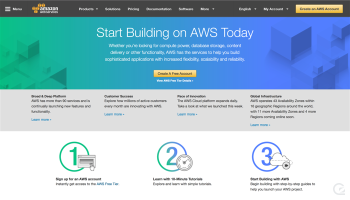
Amazon are the master of website conversion, and the AWS site is no exception. Given that potential customers can pay anything from $0 to $millions a year for AWS, defining copy that works for all audiences is a challenge. The classic yellow button in the middle with “Create A Free Account” is clearly aimed at convincing curious developers to get started and have a play.
Check out the Amazon Web Services homepage
Asana

Asana’s homepage is clean and fresh with bold brand colours. The “above the fold” section of their homepage is remarkably sparse focusing almost entirely on the title and Call-to-Action. Plus points for consistency in text between their global navigation CTA and the key button on the homepage.
Atlassian

Atlassian recently updated their site with a refreshed set of fonts and colours. They have a suite of different products, so we decided to share one of the landing page of their most popular products: Jira. As you can see, they’ve kept the button text simple and emphasised there’s no need to pay upfront for the software.
One area to improve: ensuring consistency between their global “Try Free” CTA in the navigation and the on-page “Try it free” button copy.
Check out the Atlassian Jira homepage
Baremetrics

There’s no messing about on the Baremetrics homepage – you can either watch a video or sign up straight away. The simplicity and lack of choice are a really compelling driver to encourage you to make the next step.
Check out the Baremetrics homepage
Basecamp
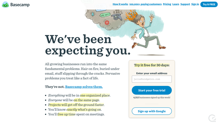
Basecamp famously test their landing pages, copy, and designs continuously. It’s almost guaranteed that by the time you read this and head to the Basecamp site their page will look different to the screenshot here!
At the time of writing, Basecamp are combining a few lines of reassuring copy with a bold and obvious button to drive you to start your trial. A lovely touch is the additional copy of “4,312 businesses sign up this week!” – no one wants to the be the first person to sit down in an empty restaurant.
Buffer
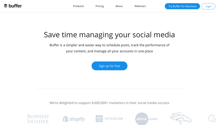
Buffer’s homepage is incredibly minimal and doesn’t even show their product above the fold. It’s all about the CTA and a compelling title. Plus points for having consistent styling between their global navigation buttons and the central CTA on their homepage.
Campaign Monitor

Campaign Monitor have taken a risk by placing their signup button on top of a video on their homepage. Thankfully their video is carefully crafted to have a dark overlay and is blurred out in places to ensure the text and button stand out on top of it throughout.
Check out the Campaign Monitor homepage
Chargebee
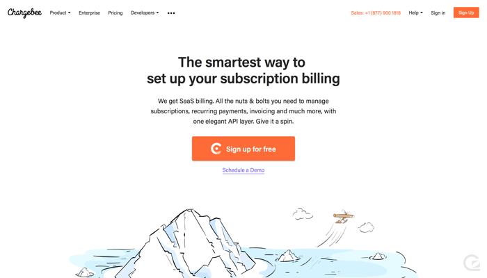
Chargebee consistently use the colour orange to indicate action buttons throughout their site. The primary CTA on their homepage is huge in comparison to the body text on their page and includes a perfectly sized logo along with compelling copy. You just want to click it – nice work Chargebee!
Check out Chargebee’s homepage
CharlieHR
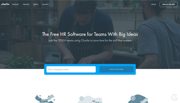
CharlieHR heavily push the idea of “free” in their CTAs – both on the homepage and throughout their site. Their signup area on the homepage is totally unmissable and doubles as a way to draw you down the page to learn more.
Check out the CharlieHR homepage
ChartMogul

ChartMogul utilise the space under their primary CTA to address the common concern potential users of SaaS products have – “will I need to enter my billing details before I can try this out?”
Check out ChartMogul’s homepage
Clearbit

Clearbit appear to be growing like crazy. However, we can’t help but wonder if that’s despite their primary CTA on their homepage. It’s big and bold, but the simple “Sign up” copy fails to convey key info that could help increase conversions. A few questions we have from seeing this button: “Is there a trial?”, “Am I signing up for a Clearbit account or for one of their specific products?”, “Will I need to enter my billing info straight away?”.
Close

Close have done a great job at making their CTAs stand out. The primary CTA on their homepage is HUGE and even puts the reassuring text of “No credit card required” inside the button.
Check out the Close.io homepage
ConvertKit
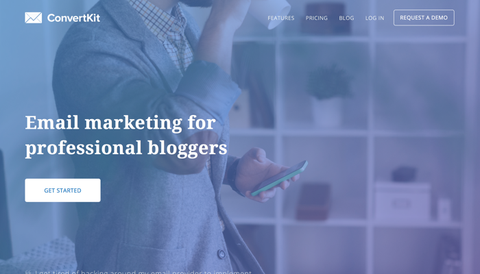
ConvertKit’s homepage is ultra simple, so your eyes can’t help but be drawn to the “Get Started” CTA. It’s not entirely clear what “Get Started” actually means though – will that get us started with a demo or will it start a trial? A little micro-copy underneath the button could really help clear that up!
Check out the ConvertKit homepage
Crazy Egg

Crazy Egg are one of the true experts when it comes to conversion rate optimisation, so their homepage and CTAs are worth paying careful attention to. Their homepage is extremely simple, with a massive email field and signup button taking pride of place. The “Show Me My Heatmap” is also incredibly compelling copy for a button – it’s in first person, and it’s really exciting to think what we’ll get when we hit the button.
As expected, this is CTA gold from Crazy Egg.
Check out the Crazy Egg homepage
Curated

Curated have utilised really compelling copy on their primary CTA to entice you into their platform – “Start curating” sounds a whole lot more enjoyable than “Start trial”.
Delighted
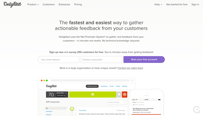
Delighted have combined a very simple signup form with reassuring copy for a compelling signup process on their homepage. The purple CTA also stands out and draws your eye.
Check out Delighted’s homepage
Desk

Salesforce Desk has a dark photographic background which is plain enough to allow the primary CTA to stand out. The copy ensures you’re not put off by the idea of spending money – it’s free to try, so why not?
Check out the Salesforce Desk homepage
DigitalOcean

DigitalOcean have cemented themselves as a developer hosting platform that cares about design. Their homepage and CTAs are clean and friendly. It’s easy to create an account, and the copy is simple and clear.
Check out DigitalOcean’s homepage
Domo
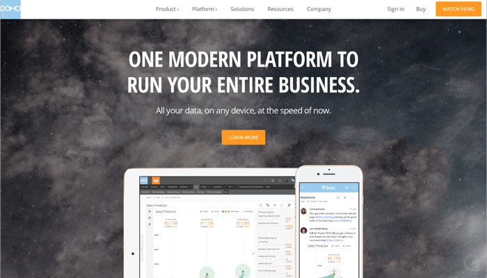
Domo is focused on enterprise, and their CTAs push you towards learning more and watching a demo rather than signing up for a trial. The orange colour is consistent throughout the site.
Drip
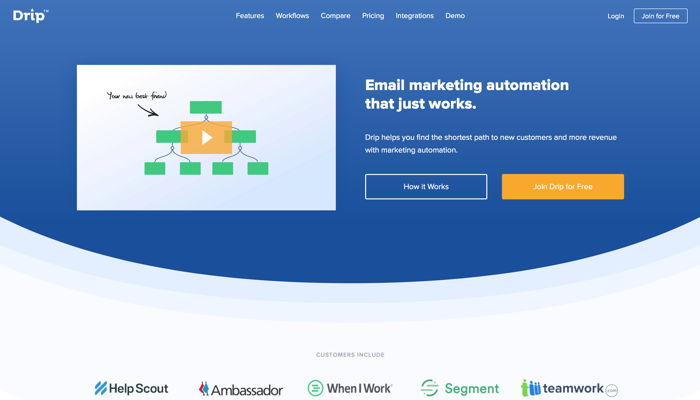
Drip’s orange primary CTA is effective because it puts your mind to rest with regards to price being a barrier from signing up. The dark blue nicely contrasts against the orange so the button stands out.
Dropbox
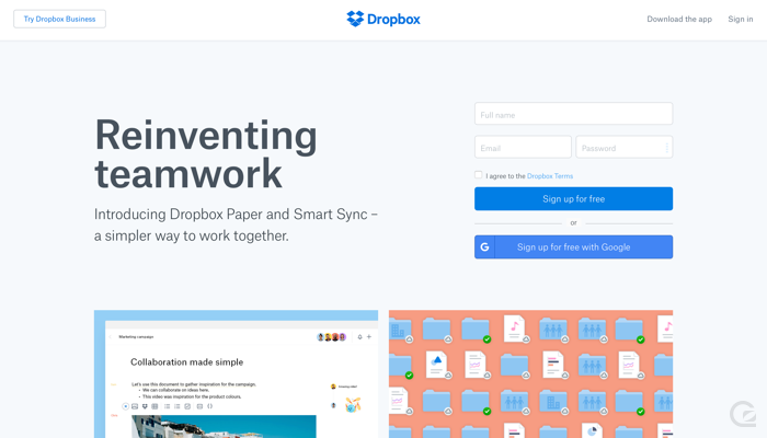
Dropbox has a number of Call-to-Action buttons on their homepage, with two of equal prominence. The clarity of what each button does and why they’re both there is obvious, and it seems to be doing the trick for Dropbox! What’s interesting is they have a third, less prominent CTA at the top right (not a common place to put an action button) to take you to Dropbox Business.
Check out the Dropbox homepage
DueDil

DueDil are pushing for visitors to request a demo on their homepage. It’s interesting to see the prominence they place on watching a video of their platform – clearly watching their video must correlate strongly with encouraging people to ultimately start using their platform.
A nice touch – they’ve used a small “play” icon on their “Watch the video” button to indicate you’ll watch the video in place rather than be taken to another page.
EmailOctopus
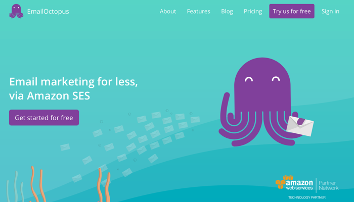
EmailOctopus are consistently using a bold purple colour for their CTAs, and the focus on free makes signing up seem just a click away. The top right CTA says “try us for free”, so the only question we have is: is there a trial? If so, how long?
Check out the EmailOctopus homepage
Expensify
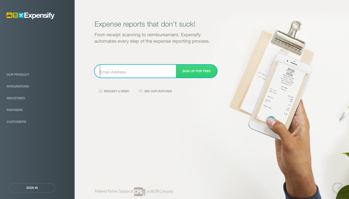
Expensify’s homepage breaks any sort of traditional layout for SaaS pages, but the signup field is unmissable.
Check out Expensify’s homepage
Framer

Framer’s whole site and product is beautiful, and their CTAs don’t disappoint. Framer consistently use the same shade of blue for all actions, and they also employ a beautiful little icon on their global nav to indicate the free trial requires a download of their app.
FreshBooks
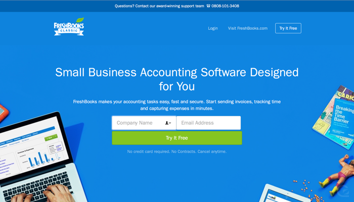
FreshBooks automatically focus you on the first field in their signup flow when you load their homepage – engaging you in the signup process instantly. Their primary CTA is very clear and is coupled with great microcopy to address common concerns – “No credit card required. No contracts. Cancel anytime.”
Check out the FreshBooks homepage
Freshdesk
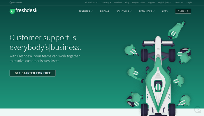
Freshdesk have kept it simple, and their primary CTA is bold and stands out from the background. The button could be larger, and they could add extra copy below the button to address concerns potential users may have.
Check out Freshdesk’s homepage
Front

Front’s site is beautifully designed, and their primary CTA is bold and generously spaced out from the rest of the content on the page. Props for ensuring their copy is consistent across the site for their CTAs too – “Try free for 14 days”.
FullStory

FullStory’s CTAs are visually striking, and the copy is consistent throughout their site. The only thing we’d improve here is ensuring there’s a little more contrast between the blue of the sign up button and the pink of the background.
Check out FullStory’s homepage
Geckoboard

Geckoboard’s primary CTA is unmissable on their homepage – it’s very clear and very obvious and encourages visitors to drop their email address right away. They’ve utilised micro-copy below the CTA to reassure you of any concerns you might have, and they have a consistent pattern of email address + green action button throughout their site.
Check out Geckoboard’s homepage
GitHub

GitHub’s homepage is as much a join form as anything – there’s no messing about here. You really will have a GitHub account as soon as you’ve completed the three fields and hit the bold green “Sign up for GitHub” button on the homepage. The only area where this example falls down is the extensive copy below the primary button outlining the legal spiel.
Google Optimize
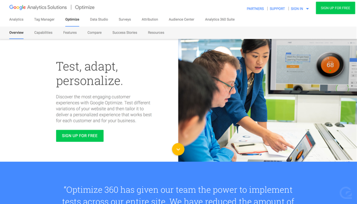
Even Google needs to encourage users to sign up! Google’s Analytics product has evolved into a suite, and their Optimize product is one a few tools that you can optionally sign up for. Their consistent bold green buttons are unmissable, and the copy is reassuringly emphasising it’s free.
Check out the Google Optimize homepage
GoSquared
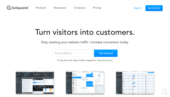
We’re quite familiar with this one as it’s our own homepage. We’re always A/B testing the GoSquared homepage and experimenting with messaging, layout, and CTAs to see what performs best. We previously had a much smaller email field and “Get Started” button, but since increasing the size of both we’ve seen a 20% increase in conversions. Not bad for a few lines of CSS.
Check out the GoSquared homepage
GrooveHQ
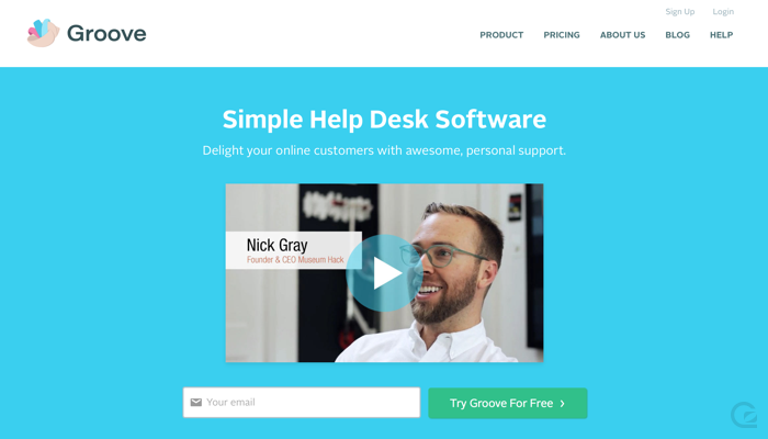
Groove’s homepage sneaks a large CTA in just above the fold. The copy is great; the only area where this could be improved is if there was more contrast between the bright blue background and the green “Try Groove For Free” button.
Help Scout
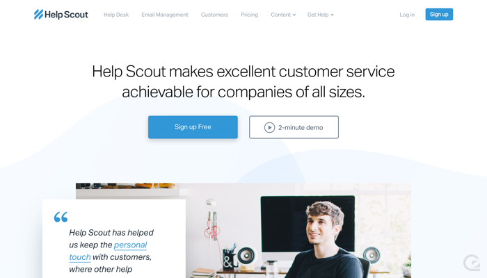
Help Scout’s buttons are clear and obvious. The “Sign up Free” button is bold and stands out against everything else on the page. The one area we’re curious about for improvement is why the CTA in the global site navigation doesn’t include the word “Free” like the primary button on the homepage.
Check out Help Scout’s homepage
HubSpot

HubSpot are experts when it comes to all things marketing, so their CTAs are not left to chance. They currently have a consistent approach of blue buttons with “Get Started” copy throughout the site. On the homepage, they’ve coupled a little copy to reassure you that getting started won’t cost you anything to begin with.
Invision
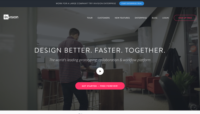
Invision have bravely used a full screen video as the backdrop to their homepage. Knowing a thing or two about design, they’ve ensured there’s a dark overlay on top of the video so the text and buttons are easy to read. The CTA copy sounds too good to be true but compels you to sign up straight away.
Kalo

Kalo have a bold background on their homepage and use a huge photo of one of their customers to make a more personal connection with the visitor. The CTA is clear and the copy is consistent and friendly throughout the site. If there was one thing we’d test on the homepage it’d be experimenting with a bold solid white button with pink text, instead of the current white outline button.
Kayako
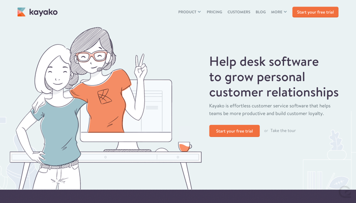
Kayako consistently use orange for their CTAs throughout their site. The copy here is clear and easy to read. There’s not a lot to dislike with Kayako’s approach here.
Klipfolio

Klipfolio’s primary CTA almost appears to float above the page – the bold red coupled with a long shadow makes the button stand out against everything else on the page.
Check out Klipfolio’s homepage
MailChimp
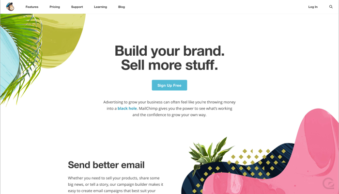
Everyone loves the quirkiness of the MailChimp brand, but their signup buttons are clear and to-the-point. It’s a good example of why getting your copy right on Call-to-Action buttons is so important – trying anything that’s too far outside the box may risk losing out on conversions from fresh visitors.
Check out MailChimp’s homepage
Marvel

Marvel’s site is beautifully simple, and their Call-to-Action buttons are no different. On the homepage there’s a heavy emphasis on starting free and addressing any concerns of the budget-conscious to get you in the door.
New Relic

New Relic are now a huge SaaS business, and their strategy for conversion has evolved over time. They currently push “Sign Up” as their primary CTA, but the button is smaller than the secondary button of “Request Demo”. The copy is short but it leaves a lot of questions in the mind of the visitor – we’d assume New Relic expect visitors to read around before committing to signing up, but we’re curious to know how much this impacts conversion.
Check out New Relic’s homepage
Optimizely
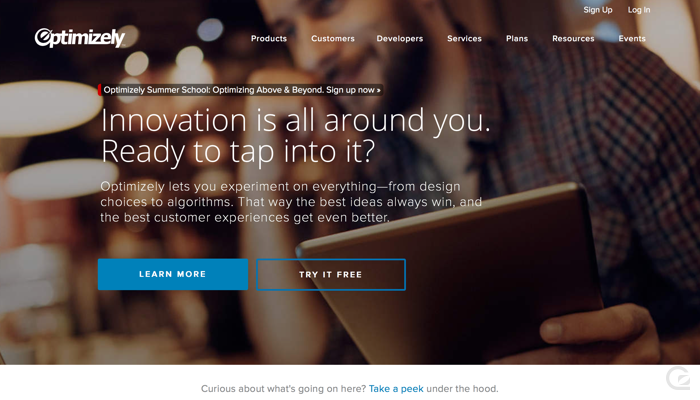
Optimizely are experts when it comes to A/B testing so their CTA game is likely on top form. Interestingly, on their homepage they push you to “learn more” rather than sign up as their primary button – taking you to the Optimizely products page.
Check out Optimizely’s homepage
Pingdom

Pingdom’s CTA is green and bold, with compelling and clear copy to start your trial. The one question we have from this is: do the “Sign up” button in the global navigation and the “Start 14 day free trial” button on the homepage perform the same action? If they do, could they share more consistent wording?
Pipedrive
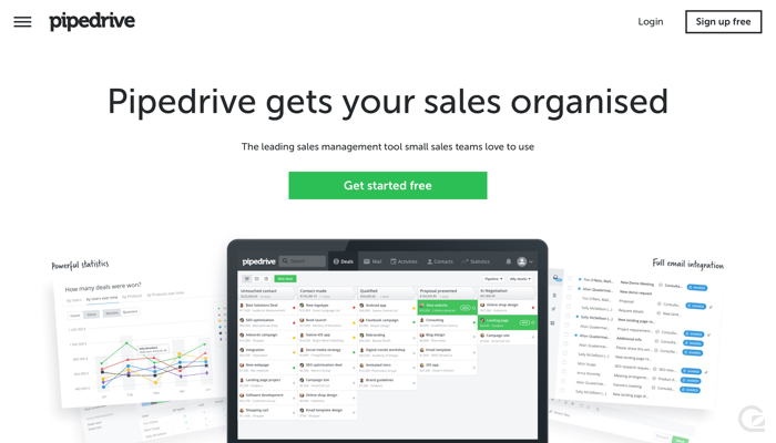
Pipedrive’s primary CTA is bright green and generously spaced so it’s unmissable.
Check out Pipedrive’s homepage
Plutio

Plutio’s still in beta, but they’re a great example of a compelling SaaS marketing site. The strong and dark purple background on the homepage ensures the bright white primary Call-to-Action button stands out immediately. “Sign up for early access” is also great copy to entice you in and make you feel like you’re missing out by not signing up right now.
Promoter
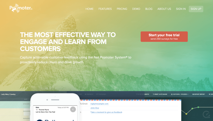
Promoter’s primary button on their homepage is large and has compelling copy – it removes a lot of concerns and draws your eye by being so large. The one area for improvement here is just increasing the contrast between the orange and the green background.
Pusher
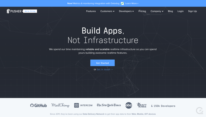
Pusher’s homepage is sharp and simple. The primary “Get Started” CTA is bold and generously spaced, so it’s unmissable. The one question we have from this area of the page is “is there a trial?” – perhaps microcopy below the button could address any concerns around what “getting started” actually entails.
Segment
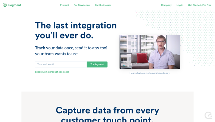
Segment personalises their homepage based on a bunch of factors so it’s rarely the same for any two people. The variant we’re seeing at the time of writing emphasises the email field with a big and bold “Try Segment” button. The copy is compelling and pushes you to get started right away.
SendGrid
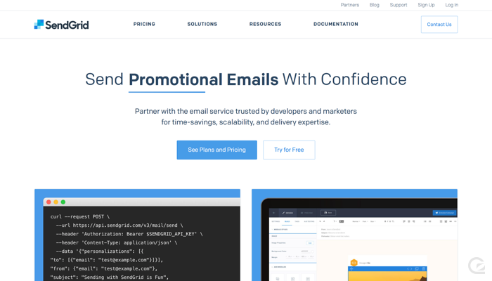
SendGrid’s primary CTA on their homepage is driving you to their plans and pricing page – it’s certainly different to most of the examples here in that it’s not pushing hard for you to start a trial the moment you hit the homepage. Perhaps funnelling visitors to the pricing page helps qualify signups more effectively off the bat.
Shopify

Shopify’s CTAs are incredibly consistent and look great – they use the same colours and styling for all primary buttons throughout their marketing site and even in their product. It’s impressive to see a business the size of Shopify maintain such consistency. Shopify’s homepage copy is very reassuring to anyone of any size looking to use them as an ecommerce platform, and their microcopy removes the primary concerns people may have from starting a trial. Lovely stuff, Shopify!
Square
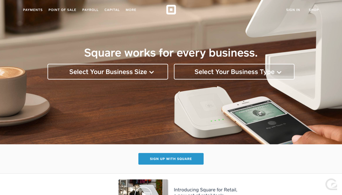
Square has a lot of options on their homepage – it seems they’re not expecting to win many new users from here but instead direct you to other parts of the site and funnel you down a more tailored journey. The real CTAs here are not the “Sign up with Square” button, but instead are the large drop down menus for business size and type.
Stripe
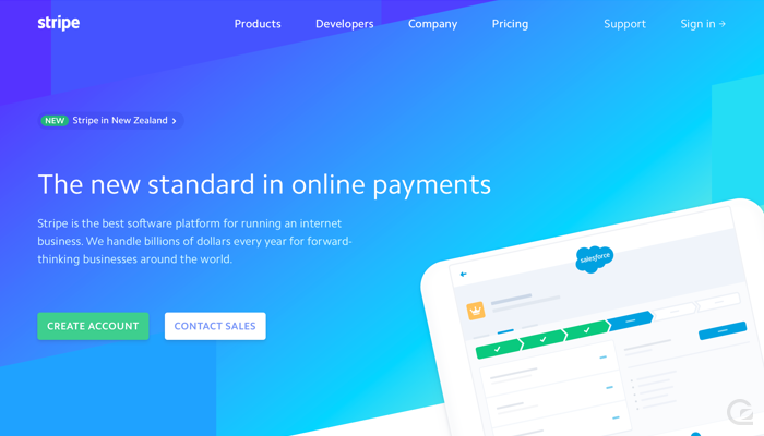
Stripe famously puts together some of the most stunningly beautiful pages on the web. Their usage of CTAs has been interesting to watch evolve – unlike almost all of the other examples here, they don’t have a consistent signup CTA in the top right of their site navigation.
Their homepage focuses on encouraging visitors to create an account, while the secondary action is to reach out to the Stripe sales team. It seems Stripe are riding on brand awareness and the hope you’ll investigate the rest of their site, as the primary CTA on the homepage still leaves a bunch of questions: is there a trial? What do I need to do to create an account? Will it be easy?
Sumo

Sumo know how to build tools that increase conversion, so they know a thing or two about CTAs. Their homepage is a masterful act of CTA design. Similar to the Basecamp example earlier, Sumo outlines how many sites are using their tools right above the CTA. The Call-to-Action area is huge and the “Try it Now” copy persuades you to take action right away.
SurveyMonkey

SurveyMonkey has a bold green background which makes it tricky for buttons to really stand out. But the use of a pure white “Sign Up Free” button manages to push itself as the key component that stands out, while the yellow “Pro Sign Up” falls into secondary prominence, despite their respective locations.
Check out SurveyMonkey’s homepage
Twilio
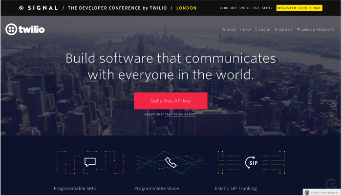
Twilio’s primary CTA is extremely developer-focused – a seemingly smart move for their target audience. It’s not about creating an account or starting a trial, it’s about starting to build something with Twilio’s APIs. This homepage, especially given they’re so big they’re a public company, is truly inspiring for anyone building a developer-focused SaaS business.
Typeform

Typeform’s homepage is a brilliant example of a minimal homepage with a very clear and obvious Call-to-Action. The primary button itself has great copy, but could be clearer to really draw your eye against the bold blocks on the left and right from the product illustrations.
Unbounce
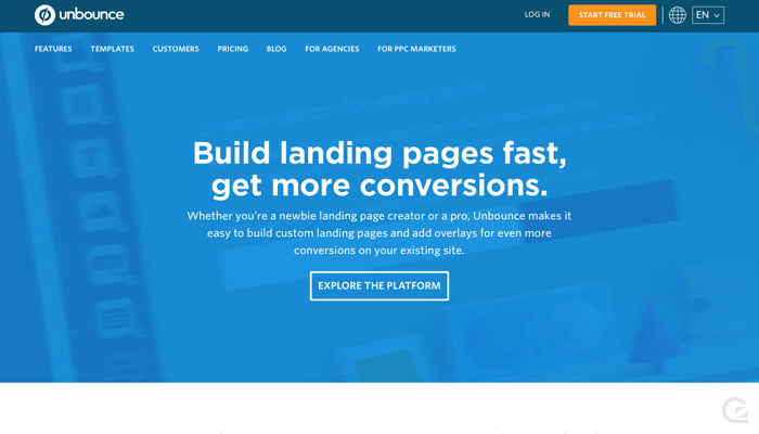
Unbounce has a different approach with their homepage – the primary CTA above the fold is not pushing visitors to sign up or create an account. Instead, they’re pushing visitors to “explore the platform”, taking you to the features page. You can always sign up via the global “Start Free Trial” button in the top navigation, but the approach to the homepage CTA here is certainly unique.
Visual Website Optimizer
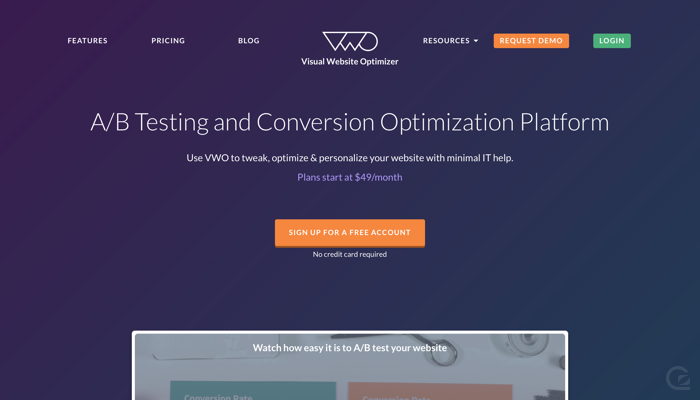
As a website testing platform, it’s fairly safe to assume VWO know what they’re doing with their CTAs. As expected, the copy is concise and effective, and the colour is bold and stands out clearly from a solid dark background. Good job VWO!
Webflow
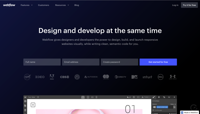
Webflow has carefully balanced beauty and conversion on their homepage – the signup fields and primary signup button are laid out horizontally and are just above a wall of big name logos. The copy of “Get started for free” is also compelling when combined with the three signup fields – you know exactly what you’re getting!
Wistia
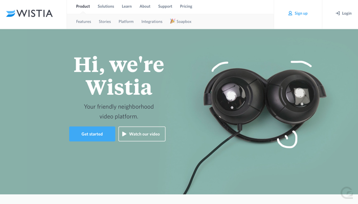
We’re big fans of Wistia and their quirky, fun marketing. Their homepage content appears to change frequently, so it’s likely that by the time you’re reading this their homepage will have changed again. Currently, the blue primary CTA on their homepage doesn’t stand out on the turquoise background, but the simplicity of the page makes it hard to ignore.
Wootric
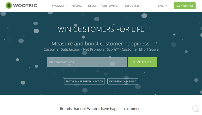
Wootric utilise a huge email field and consistently labelled green buttons for their CTAs throughout the site. Simple but effective.
Workable

Workable’s homepage has a carefully selected photo that avoids distracting from the text and buttons – by ensuring the content is left-aligned, the primary CTA stands out on top of a dark and blurry area of the photo.
Also a nice touch – we naturally look where other people are looking, and on the Workable homepage, the people in the photo are looking towards the left of the page – exactly where they want the visitors eyes to be drawn.
Xero
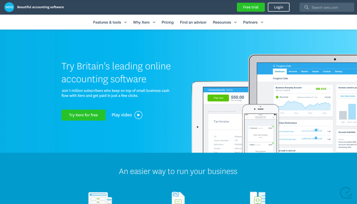
Xero’s primary CTA is good on the copy front, but the green clashes with the bright blue brand colour of the background. They could avoid the colour clash and make the button stand out more by surrounding the button on a darker background or changing the green to a darker shade so it’s clearly differentiated from the vivid blue.
Zapier

Zapier are very bold in essentially embedding their signup form on their homepage. They consistently use orange throughout their site to indicate action buttons. The only thing we’d improve here is the copy on their primary CTA button to something more reassuring like “Sign Up for Free” as in their header.
Zendesk

Zendesk’s homepage is fresh and clean. They’ve prioritised booking a demo over starting a trial indicating a stronger focus on enterprise sales than self-service, but both actions are very clear and well differentiated visually.
CTAs FAQs
Need any more help debunking CTAs? We’ve answered the most commonly asked questions about CTAs below.
You can find further help and advice on how to supercharge your marketing efforts through our Engage offerings. Here, we’ll take you through the likes of audience segmentation, advance lead forms, out-of-office lead capture, HTML email support and much more.
What is a CTA?
A CTA is a marketing technique that directs users to complete a specific action, such as to purchase an item or contact the company for a consultation as just two common examples.
What does CTA stand for?
CTA stands for call-to-action and is commonly abbreviated as CTAs, which is the plural of CTA. These may consist of lots of intended actions you want users to complete while on your website, and are often facilitated through CTA buttons.
What is CTA in marketing?
CTA in marketing is really the pinnacle of the efforts to get the user engaged with the website or company in the first place. That’s because the aim of this engagement is to get them to complete a certain action, which is likely to result in a conversion.
What is a call-to-action button?
A call to action button makes conversions just a click away, as the button allows for the intended action to be completed. Call-to-action buttons can take various different forms, but for ‘buy now’ buttons, it can severely reduce the number of actions needed to complete checkout, which can be extremely effective in boosting sales, as just one example.
What is the best call-to-action button?
The best call-to-action button is going to one that is well designed, acts as a shortcut to boost conversions and ultimately, factors in the user experience and overall customer journey. We have plenty of examples and explanations above which explain how to create call-to-action buttons, plus what to look out for to achieve success.
Free E-Book: Learn how to create highly converting CTAs in ecommerce, agencies, publishing, and more!
Ready to shake up your CTAs into effective marketing campaigns that deliver results? As part of our selection of Grow With GoSquared resources, we’ve created a free e-book called The Fundamentals of Web Analytics. This handy guide features our best tips and tricks to create better marketing decisions, including all things call-to-actions.
Download your copy for free today, or visit our website to learn how GoSquared can grow your business through customer engagement, email and messaging, analytical data and much more.


